-

CN
-

WeChat

-

Mobile Site

-

Search
-
-
Creating a life of high quality for all people.
Sunshine and health are two important elements in a high-quality life. Linuo Group, Wspecializing in ith solar power and healthcare branches industriesas its two development priorities, Linuo Group has been striving to develop itself steadily and to build a life of high quality for all peopleus all.
-

-
Communication Bridges Gaps
We will bring you the latest news. We may be separated by oceans and landmasses, but we share the fate of our planet. What happens in China, even in one corporation like Linuo Group, is relevant to all of us in one global marketplace and in one natural environment.
-
-
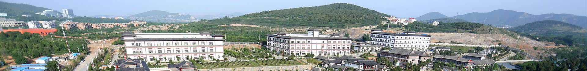
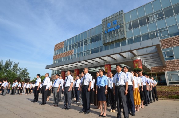
The integration of time-honored enterprises and emerging companies
Linuo Group is a meeting of subsidiaries in several fast-growing sectors, but more importantly, is an integration of several historic companies, some a century old, with newly established high tech companies. This is probably a unique combination in China, inspiring all Linuo team members with tradition and innovation, while creating a special and respected brand.
-
-
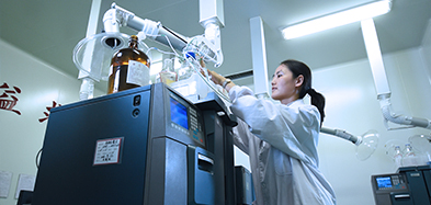
Innovation shapes a better future
Constant innovation is a key driver of corporate growth. Linuo Group places great emphasis on innovation in all areas of production, service, management and marketing. We are here to meet the needs of consumers in the new era and ceaseless innovation is crucial.
-
-
The integration of Historic Companies Enterprises with new High-Tech enterprises
Linuo Group companies have taken quite different paths to lead them to the present day. Some are more than a century old, not something that can be said about many Chinese enterprises today, while others are newly founded high-tech companies. This makes for an interesting and mutually inspiring mix of Group members, contributing to a deep and meaningful Linuo brand.
-
-
Join Linuo and design the future
· Do you want to design a better future?
· Then Linuo Group is for you!